The Menokin Foundation has designed an updated look that reflects the sophistication of The Glass House Project.
Here’s what you’ll see in Menokin 2.0:
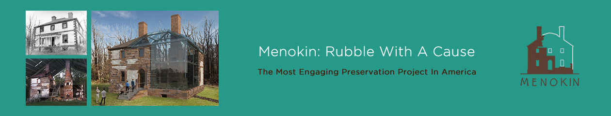
A NEW LOGO
The redesigned logo is a simplified graphic of the Menokin Glass House; the colors represent the iron-infused sandstone and the architectural Glass.
![]()
A NEW COLOR PALETTE
The updated color palette is derived from the physical materials of the house. The colors were created using software that extracts the colors from photographs.

A CUSTOM FONT
Inspired by the handwriting samples on the 1940 HABS (Historic American Building Survey) drawings of Menokin, this font is uniquely ours.

WHAT’S NEXT?
We are currently updating our website to make things easier to find and prettier to look at. We hope to have that launched by late summer or early fall.
Tell us what you think!
Looks great!!!!
Dudley
Sent from my iPhone
>